In the world of smart devices, we’ve gotten used to user interfaces changing from time to time. What trends have we seen so far, and where are we now? This article takes them in order.
Graphical interfaces don’t only evolve because of trends; they also adapt to user habits. In the beginning, realistic, material-like design dominated so digital surfaces would resemble real objects as much as possible. That was followed by flat design, glassmorphism, neumorphism, then liquid glass. The essence stayed the same throughout: clarity, speed, brand experience, and an exciting visual toolkit.
Skeuomorphism
The goal of the skeuomorphic approach is for digital elements to resemble real objects: leather, wood, metal textures, light and shadow, bevelled buttons. The main advantages are learnability and trust, since it relies on familiar metaphors. Its downside is that it can easily lead to visual overload and an “old-fashioned” feel.
Flat design
Flat design prefers two-dimensional, decoration-free visuals: clean shapes, vivid colours, typography-centric layouts, and minimal texture. Benefits include speed, responsive-friendly implementation, and clear visual logic. The drawback is that excessive simplification can hurt discoverability (“what am I supposed to tap?”). This led to “flat-plus” solutions (subtle shadows, elevation), as seen in modern versions of Material and iOS.
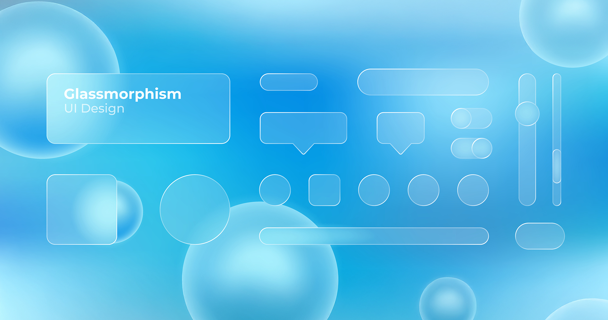
Glassmorphism
Glassmorphism uses “glassy” layers: blurred backgrounds, translucent panels, subtle rim light and shadow, and multiple stacked layers. It works well when you want visual hierarchy and a light, floating feel, but taken too far it can become cluttered or reduce contrast. The style became widespread in the 2020s and appeared in major systems too (e.g., macOS Big Sur, Fluent “Acrylic”). In this case, the background is colourful and textured so there’s something for the “glass” to react to.
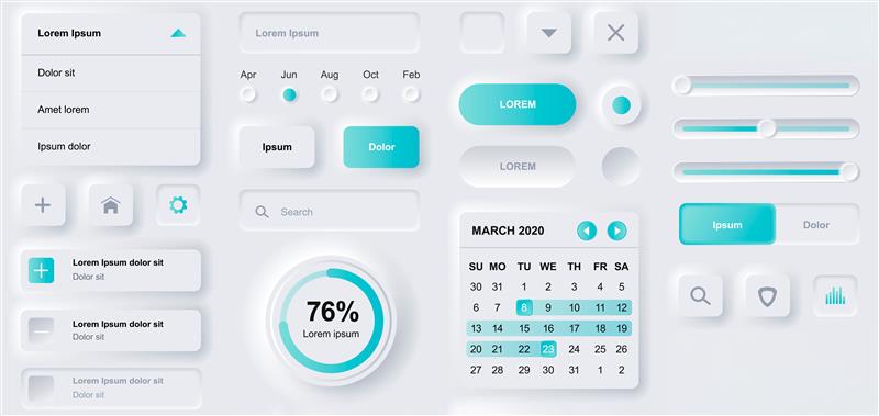
Neumorphism
Neumorphism combines the cleanliness of flat design with soft depth: similar tones, gentle light–shadow pairs, and slightly raised or inset surfaces. It feels elegant and premium, but is risky in terms of contrast and accessibility. For simple widgets, controls, or brand-building micro-surfaces, it still works well today.
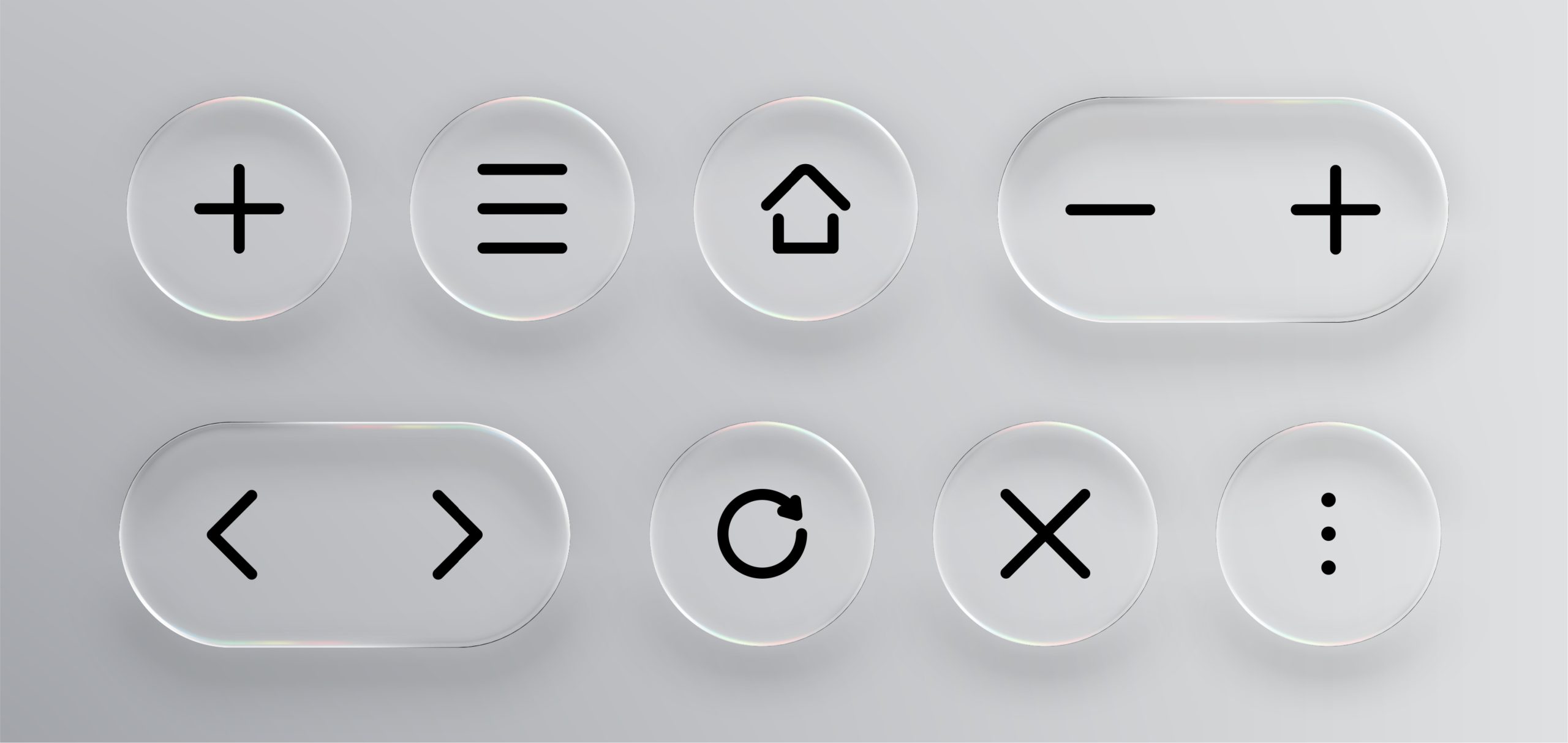
Liquid Glass
Apple’s “Liquid Glass” approach brings glassy layering to life: dynamic, organic refractions, liquid-like motion, and realistic material behaviour. Buttons look like tiny lenses, adding a sense of depth and a natural effect. Liquid Glass delivers a premium brand experience while keeping the system fast and usable.
Which surface paradigm you choose largely depends on where and for whom the site or app is being created. It’s worth weighing the pros and cons of each direction and applying them consistently across your UI surfaces.