
White Takes Center Stage
The decision was news in itself: it is the first time since the program began in 1999 that Pantone has chosen a white – and only three neutrals have ever held the title (2021: Ultimate Gray, 2025: Mocha Mousse, and now Cloud Dancer).
This is not a sterile, clinical white but a slightly warm, canvas-like shade – which is exactly what makes it so easy to combine. According to Pantone and its marketers, the choice is a kind of cultural mirror: it reflects our collective need to finally give our attention room to breathe in an overstimulated, information-saturated world.
But what does this mean in practice? How do marketing and branding turn a color that is “just white” into sellable, experience-driven content? That is what this article explores.
One Color, Nine Brands, Three Directions
Pantone did not launch Cloud Dancer alone: together with its official launch partners, it built a year-long, cross-category campaign around the color. The nine collaborations fall into three broad groups: home and technology, sensory experience, and creativity and play.
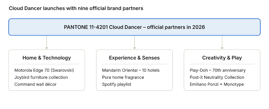
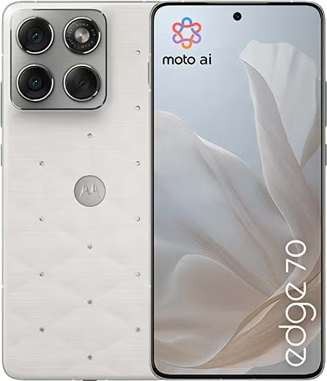
Motorola’s multi-year partnership with Pantone culminated this year in the motorola edge 70 Cloud Dancer Special Edition, which features a quilted vegan leather back and Swarovski crystals.
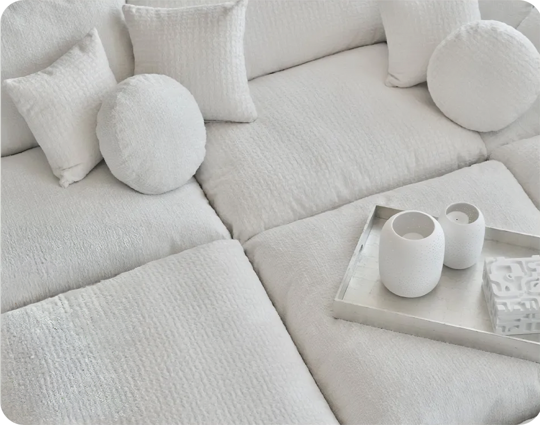
Joybird introduced the color across 300+ furniture styles in new tactile fabrics (Soul and Karina), while Command launched a limited-edition Cream Speckled wall décor collection.
On the sensory side, Mandarin Oriental introduced Cloud Dancer-inspired afternoon tea sets, spa treatments and Christmas letters-to-Santa mailboxes at ten of its luxury hotels – from London to Tokyo. Pura’s home fragrance diffuser translated the color’s airy character into scent, while Spotify, in its first collaboration with Pantone, created a personalized playlist reflecting the color’s mood.
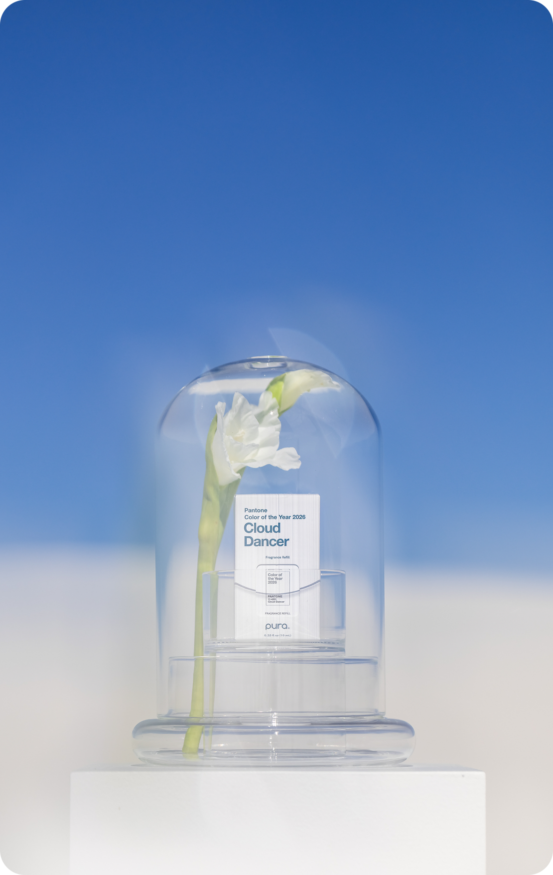
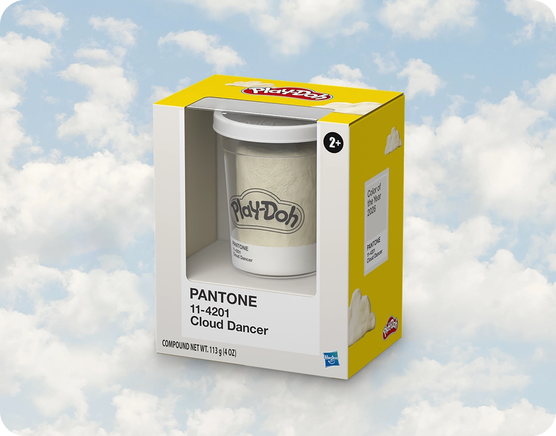
On the creative side, Play-Doh celebrated its 70th anniversary by releasing its modeling compound in Cloud Dancer, while Post-it’s new Neutrality Collection brought the Pantone Color of the Year into its sticky-note palette for the first time. Pantone also teamed up with Monotype to create a typographic expression of the color (using the Jensen Arabique typeface) and with illustrator Emiliano Ponzi on a limited-edition tote bag – the first stop in a year-long initiative showcasing artists.
From Runway to Shelf: Fashion and Design
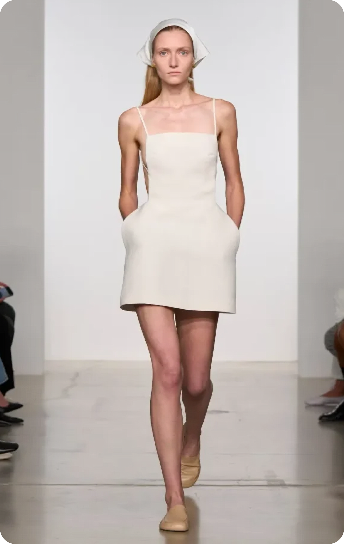
Cloud Dancer lived on beyond the official partnerships, too: it also appeared on the spring/summer 2026 runways as a defining “palette cleanser.” Alongside Dior, Celine, Calvin Klein and Bottega Veneta, Balenciaga, Jil Sander and Carven also worked with it in a wide variety of textures and silhouettes.
In brand, packaging and web design, Cloud Dancer is not a logo color but a system color: it is used as a background and as the inner surface of packaging, because it gives typography and iconography room to breathe and reinforces a sense of “clean, earned trust” – especially in the healthcare, finance and wellness categories.
And What Comes After White?
The year of Cloud Dancer is slowly drawing to a close, and the industry is already speculating about what will follow white. True to tradition, Pantone is expected to announce its 2027 Color of the Year in early December, but the signs so far already point in a clear direction. The major paint manufacturers have, one after another, opted for earthy, nature-inspired tones: Behr named Grounded, a deep olive green; Dutch Boy chose Deep Rooted, a terracotta; Dulux picked a sage green; and PPG selected Country Soil, a clay-like beige-taupe, as their colors for 2027. Pantone’s own forecasts paint a more vibrant picture: its New York Fashion Week spring/summer 2027 color report pairs saturated shades – such as Princess Blue, Chili Pepper and Dragon Fire – with soft, botanical tones, while the 2027 home décor palettes emphasize joy alongside calm. It seems, then, that color will gradually return next year on top of Cloud Dancer’s clean foundation, and brands would do well to start thinking now about how to build warmer, more characterful shades on it.
Sources
- Pantone hivatalos bejelentés: PANTONE 11-4201 Cloud Dancer, Color of the Year 2026
- NPR: Pantone chooses white ‘Cloud Dancer’ as its 2026 Color of the Year
- Motorola News: motorola edge 70 Cloud Dancer Special Edition, Swarovski
- DesignRush: Pantone Turns Cloud Dancer Into a Cross Industry Brand Platform for 2026
- Who What Wear: Shop Pantone’s 2026 Color of the Year, Cloud Dancer – kifutók, márkák
- House of Colour: Pantone Colour of the Year 2026 – Find Your Best Shade of Cloud Dancer
- Creative Boom: Pantone crowns ‘Cloud Dancer’ as its Colour of the Year 2026
- The Architect’s Newspaper: Pantone’s 2026 Color of the Year is Cloud Dancer – kritikus hang
- Magnt: Pantone Color of the Year 2026: Cloud Dancer, Explained for Brands
- FashionUnited: Pantone NYFW spring/summer 2027 color trend report – the top 10 colors
- International Housewares Association: 2027 Home Color Forecast Offers Respite and Joy in Noisy World
- Livingetc: The Predictions for 2027’s Color of the Year Have Started – Behr, Dutch Boy, Sherwin-Williams, Dulux
- Hardware Retailing: PPG Announces Country Soil as 2027 Color of the Year