The further back we look from where we are, the more clearly defined the path we took to get here.
The beginning of the 1900s saw the influence of Japanese Zen which itself began in the 12th Century, with its focus on simplicity and empty or open space, begin to sweep through Western art and design.

Some say Zen’s popularity in the west, spiked due to a visit by a renowned Zen Buddhist monk to the World Parliament of Religions in Chicago in 1893 . It reminds me of that old joke: the hotdog stand guy asks the monk, “What do you want on your hot dog?” and the monk says, “Just make me one with everything.”
Anyway, when Minimalism took hold it never really let go. The word itself was first used in English in 1915 to describe Kazimir Malevich‘s, Black Square on White Ground.
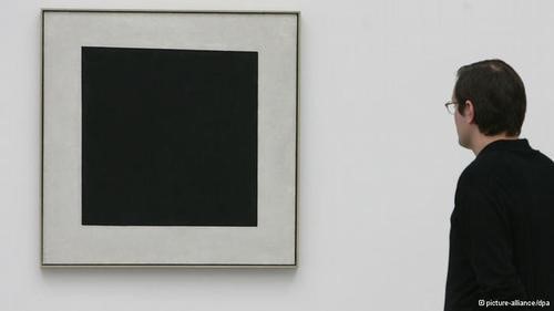
Black Square on a White Ground, 1913. First exhibited in 1915 at the rather hipster sounding, Last Futurist Exhibition of Paintings 0.10.
Malevich was born in the Kiev Governorate in 1879 to Polish parents and his work is part of the Russian Konstructivist movement that, together with artists associated with the Bauhaus, spearheaded Minimalism in Europe.
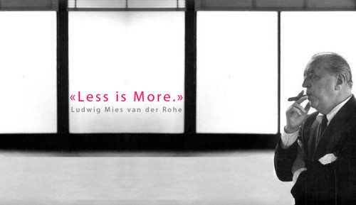
Ah, Central Europe… And it’s the home of Hammer Agency. I live in Prague but a couple years ago, I drove 2 hours south to Brno to visit another home – the newly renovated Tugendhat House, designed in the 1920s, by Ludwig Mies.

Mies, along with Le Corbusier, Alvar Aalto, and Frank Lloyd Wright, is widely regarded as one of the masters of modern architecture and was the last director of the Bauhaus school before emigrating to the States in 1930.
Innovative and influential, he is known for the aphorism, “God is in the detail” and for adopting the phrase “Less is More” as a precept for minimalist design.
As expected, the details of the Tugendhat House, though not very small or Godlike, were both simple and amazing: from its door-stops, to the huge front window that retracts vertically with the press of a button, like in a car-door.
Mies’ influences include the efficiency of Russian Constructivism and Dutch De Stijl movements and was interested in expressing underlying ideas that defined the modern age of production – an aesthetic of both form and function. This extended to signs, logos and fonts.

Toronto-Dominion Centre logo – font text created by Mies.
Although his powerful designs, revealing beauty in their simplicity, continue to inspire, the philosophy behind it was not entirely original.
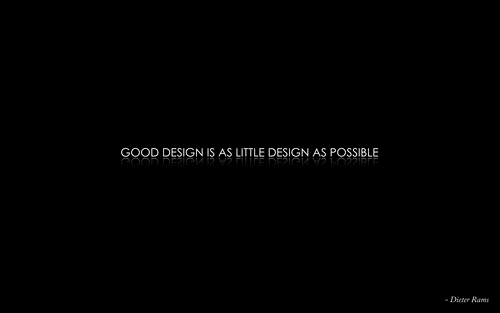
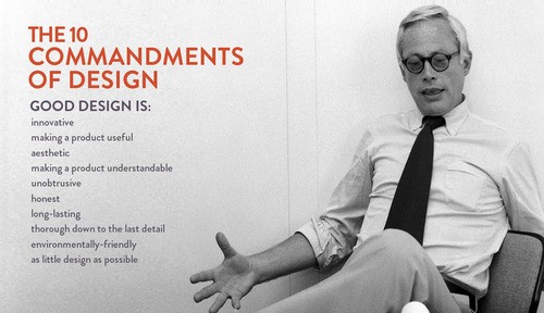
Which brings us to Herr Dieter Rams. A German industrial designer “who embraced many of the same principles and ideals found in Bauhaus”, Rams is known for his work with the consumer products company Braun. His, Less and More , exhibition (clearly the title is a nod to Mies’ “Less is More”) toured museums in Tokyo, London, Frankfurt and San Francisco from 2009 -2012.
In the 1970s, he said the world of design was becoming a mess: “an impenetrable confusion of forms, colours and noises.” In this world, he knew he was (and is) one of the most influential. So not wanting to add to the mess, he wished to test his own designs for their objective worth.
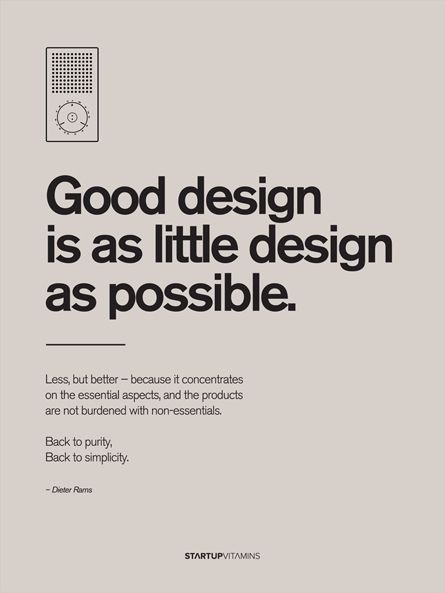
A qualitative measure proving impossible, he instead began to compose what he considered the 10 most important principles of what he considered good design. Also known as good design’s ‘10 Commandments’.
Rams has since stated that Apple Inc is one of the only companies today that designs products according to his ten principles
Apple’s chief designer is Jonathan Ive and Steve Jobs is his “spiritual partner at Apple.” Fortune magazine stated in 2010 that Ive’s designs have “set the course not just for Apple but for design more broadly.”

Though Steve Jobs, himself a Japanese Zen Buddhist, never confirmed or denied the meaning of Apple Inc’s logo, as a minimalist symbol for irreverent or anarchic discovery of knowledge, this one is hard to beat.
I’ve discusses Dieter Rams’ influence in a 2011 article in The Telegraphentitled, “Apple has achieved something I never did” .
“What Dieter Rams and his team at Braun did was to produce hundreds of wonderfully conceived and designed objects: products that were beautifully made in high volumes and that were broadly accessible”. Little wonder, then, that the calculator on the iPhone and iPod Touch is so clearly inspired by Rams’ version for Braun.

TP 1phono transistor, 1959, designed for Braun by Dieter Rams (left). The iPhone, designed for Apple by Jonathan Ive
Modern design, Apple’s aesthetic, Rams’s definition, Mies’ form and function, and Malevich’s Minimalism all seem to be shot, like a single arrow, from the ancient bow of Zen Buddhism. Though the arrow metaphor maybe a little too narrow to allow for the breadth of influence each of these has had on modern design, time does well to define its arc.